COPPERDEN
SERVICES
Brand Naming
Brand Identity Design
Logo Design
Packaging Design
ABOUT
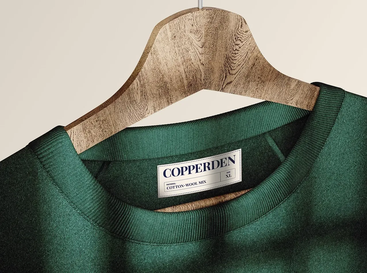
Copperden is a men’s apparel brand that started its base in London, UK. The brand seeks to provide good quality timeless clothing that remains a part of its customer’s wardrobe for a long time. Copperden values sustainability, minimalism, eco-friendly and ethical practices in fashion.
GOALS
To look semi-premium, sustainable and become a staple brand in every man's wardrobe. The brand needed a visual identity that reflects all of those values, is consistent across platforms, considered premium and instantly appeals to its ideal customer.


A Copperden man makes impactful statements without being loud. A Copperden man believes that simplicity stands out. He does not need vibrant colours to draw attention. He commands the room he walks in with his style and etiquettes.
He is magnetic in conversations because he listens intently and shows curiosity but he does not gossip.
A Copperden man believes in giving back to his community, owning up to his responsibilities and leading a sustainable and eco friendly life.
His values are not meant for showcase or social media. It is simply his lifestyle.


"Working with my brand consultant "Jayshree" has been an absolute pleasure! She is incredibly helpful and understanding, especially as I’m running a start-up with a tight budget. The mood board she presented was truly appealing to me as a decision-maker. What stood out was her thoughtfulness...she went above and beyond to make it look semi-premium while addressing all my concerns and requirements. Her dedication to helping me create a brand that truly represents its potential is unmatched.Thank you for everything!"

Tonic Method
Lifestyle